Building a professional construction company website requires careful planning and the right tools. In this comprehensive tutorial, I'll walk you through building the Vent-Build construction company website (backup site) using WordPress and Elementor page builder. You'll learn responsive design implementation, essential WordPress plugin configurations, and professional web development practices for construction and service-based websites.
What You'll Build
- Platform: WordPress 6.9 with Elementor page builder
- Website Type: Professional construction company showcase
- Key Features: Responsive design, contact forms, SEO optimization, performance caching
- Time Required: 6-8 hours for complete setup
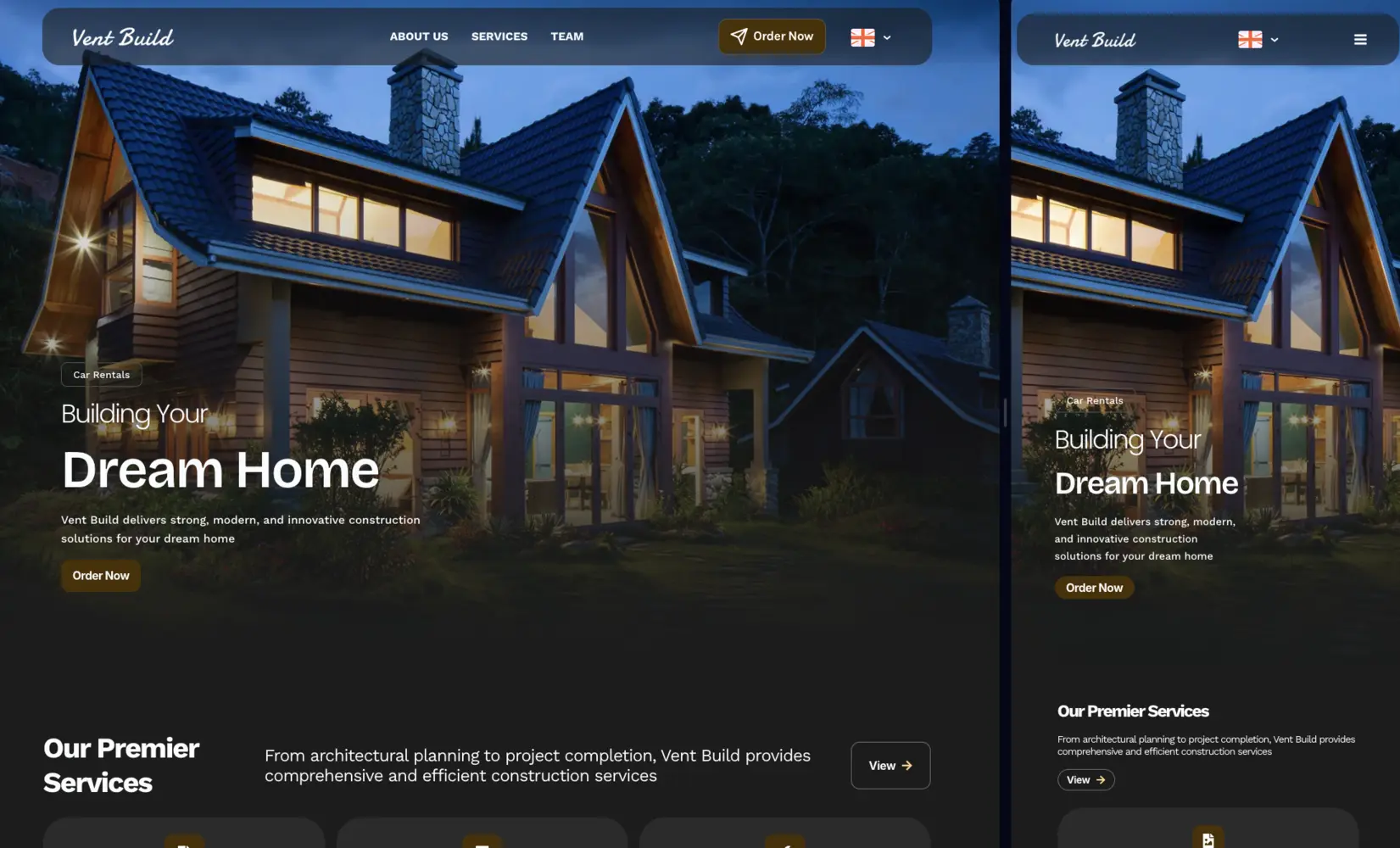
The Vent-Build project demonstrates how WordPress combined with Elementor can create a stunning, responsive website that converts visitors into clients. This tutorial covers everything from initial WordPress installation to final responsive design adjustments.
What You'll Learn
- How to install and configure WordPress for professional websites
- Essential plugin setup for construction company sites
- Elementor global settings and responsive breakpoints configuration
- Building hero sections with compelling CTAs
- Creating service showcases and project portfolios
- Implementing mobile-first responsive design
- Performance optimization and SEO best practices
- Contact form integration and lead capture systems
Key Features of This Build
- Fully responsive across mobile, tablet, and desktop devices
- Lightning-fast load times (under 1 second)
- SEO-optimized with Rank Math integration
- Multi-language support with GTranslate
- Automated backup system for data security
- Analytics integration (Google Analytics & Microsoft Clarity)
- Professional contact forms with message storage
- Project portfolio with filtering capabilities
WordPress powers over 43% of all websites on the internet, making it the world's most popular content management system for building professional websites.
WordPress Installation & Initial Setup
The foundation of any successful WordPress website begins with proper installation and hosting configuration. For this construction company website, I selected WordPress 6.9 as the content management system, hosted on Hostinger's optimized servers, starting from 40 usd per year + 1 free domain included with PROMOCODE = HIPSERGEYPBG
Quick Setup Overview
- Time Required: 5-10 minutes
- Requirements: Web hosting account, domain name
- Recommended Host: Hostinger, SiteGround, or Bluehost
Result: Fresh WordPress installation ready for customization
Installation Steps
- Access Your Hosting Control Panel: Log into your Hostinger, cPanel, or hosting dashboard
- Find Auto Installer: Look for "WordPress Installer".
- Select WordPress 6.9: Choose the latest WordPress version from available CMS options
-
Configure Installation:
- Site Title: "Vent Build" (your company name)
- Admin Username: Create a secure username (avoid "admin")
- Admin Password: Use a strong password with 16+ characters
- Admin Email: Your business email address
- Complete Installation: Click "Install" and wait 2-3 minutes for the process to complete
-
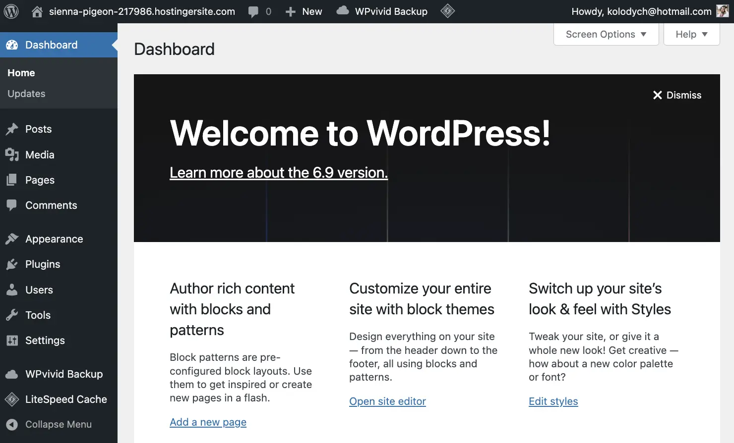
Login to WordPress: Visit
yourdomain.com/wp-adminand enter your credentials
Initial Configuration Tasks
After installation, complete these essential configuration steps to secure and optimize your WordPress site:
- Permalink Settings: Go to Settings → Permalinks and select "Post name" for SEO-friendly URLs
- Site Title & Tagline: Update in Settings → General with your company name and slogan
- Timezone Configuration: Set correct timezone in Settings → General for accurate post scheduling
- Delete Sample Content: Remove default "Hello World" post and sample page
Essential WordPress Plugins I used and their configuration.
The right plugin stack transforms WordPress from a basic CMS into a powerful website development platform. Here's every WordPress plugin I used for the Vent-Build website, with detailed configuration instructions and specific use cases.
Important: Install plugins one at a time and test functionality before adding more. Too many plugins can slow down your website. The 14 plugins listed here are carefully selected for specific purposes.
1. Elementor Page Builder
Elementor is the cornerstone of modern WordPress website design, offering intuitive drag-and-drop functionality without coding requirements. This is the most critical plugin for the entire build.
- What I Used It For: Complete page layout design, hero sections with background images, services showcase with icon boxes, responsive design across all devices, global color and typography settings
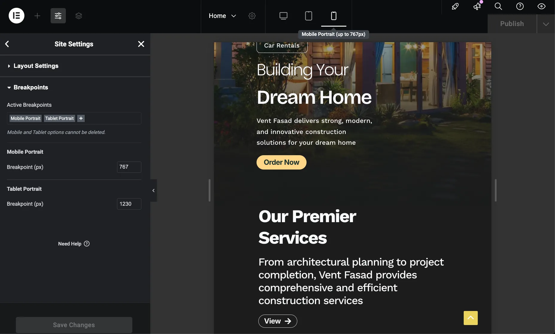
- Key Configuration: Set global colors matching brand identity, defined custom breakpoints (767px mobile, 1230px tablet), configured content widths (420px mobile, 800px tablet)
- Version Used: Elementor 3.34.1 (free version)
Installation Steps
- Navigate to Plugins: Go to Plugins → Add New in WordPress dashboard
- Search for Elementor: Type "Elementor" in the search box
- Install & Activate: Click "Install Now" then "Activate"
- Skip Onboarding: You can skip the setup wizard and configure manually
Download: Elementor Page Builder on WordPress.org
Elementor Global Settings Configuration
After installing Elementor, configure these essential global settings to ensure consistent design across your construction company website.
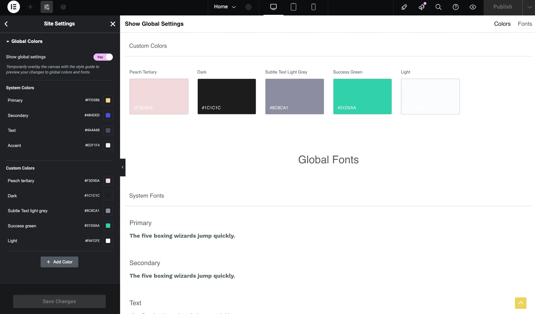
- Global Colors Setup: Navigate to Elementor → Settings → Style to define your brand color palette. This ensures consistency across all pages and elements.
- Responsive Breakpoints: Set custom breakpoints to control how your site adapts to different screen sizes: 767px for mobile devices and 1230px for tablet/desktop transition
- Content Width Settings: Configure maximum content widths for each device type: 420px for mobile and 800px for tablets. This ensures readable line lengths and proper content presentation.
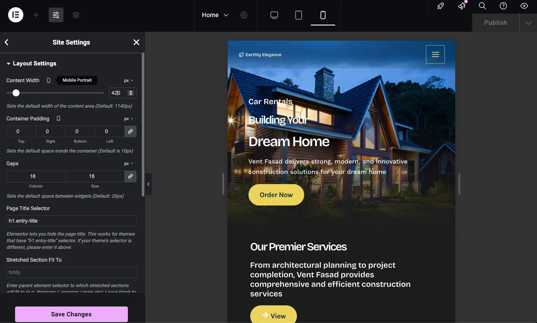
Hero Section Design & Implementation
The hero section is the first element visitors see on your construction company website. Here's how to create an impactful hero section using Elementor's visual editor.
- Desktop Layout Configuration: Added background image, compelling headings, call-to-action text, and prominent button. Configured margins and paddings for the desktop view first, establishing the baseline design.
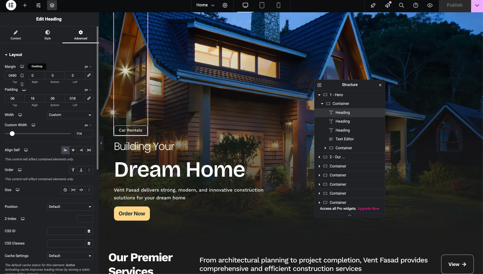
- Responsive Adjustments: After perfecting the desktop layout, individually adjusted margins, paddings, and font sizes for tablet and mobile views to ensure optimal presentation across all devices.
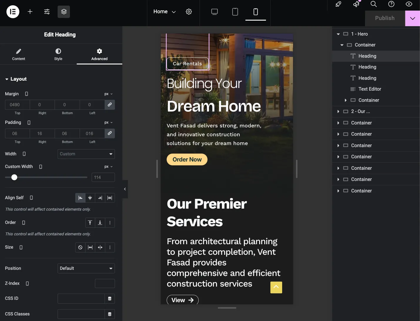
Services Section Layout
The services section showcases your construction company's core offerings. Proper padding ensures the content breathes appropriately on each device type.
- Desktop Padding (>1230px): 50px left and right padding, following the specifications from the designer's Figma file
- Tablet Padding: 32px left and right padding, custom adjustment for optimal tablet viewing experience
- Mobile Padding: 16px left and right padding, as specified in the designer's Figma file for mobile devices
These progressive padding adjustments ensure the services section maintains visual balance and readability across all screen sizes while preventing content from feeling cramped on smaller devices.
Final Website Preview
After completing all configuration steps, Elementor settings, and responsive adjustments, the Vent-Build construction company website achieves a professional, modern appearance across all devices.

The combination of properly configured Elementor settings, responsive breakpoints, and device-specific adjustments creates a cohesive, professional website that serves both desktop and mobile visitors effectively.
2. Contact Form 7
Contact Form 7 remains WordPress's most trusted contact form solution with over 5 million active installations. It's lightweight, flexible, and perfect for construction company lead capture.
- What I Used It For: Main contact form in "Get in Touch" section, quote request forms for construction services, newsletter subscription integration, lead capture with email notifications
- Forms Created: Contact form, Quote request form, Newsletter subscription
Basic Configuration
- Install Plugin: Install and activate Contact Form 7 from Plugins → Add New
- Create New Form: Go to Contact → Add New
- Configure Fields: Add name, email, phone, and message fields with proper validation
- Set Email Notifications: Configure admin email and auto-reply messages in Mail tab
-
Copy Shortcode: Copy the form shortcode like
[contact-form-7 id="123"]
Download: Contact Form 7 on WordPress.org
3. Flamingo
Flamingo provides secure message storage for Contact Form 7 submissions, ensuring no lead is lost even if emails fail to deliver.
- What I Used It For: Storing all contact form submissions in WordPress database, backup system for email delivery failures, managing customer inquiry history, export capabilities for CRM integration
- Configuration: Zero configuration needed - automatically integrates with Contact Form 7. Messages appear in WordPress admin under Flamingo menu
Download: Flamingo on WordPress.org
4. Rank Math SEO
Rank Math is the most comprehensive WordPress SEO plugin, combining features of multiple tools in one package. It's essential for ranking in search engines.
- What I Used It For: On-page SEO optimization for all pages, XML sitemap generation for search engines, schema markup for construction business, meta title and description optimization, local SEO configuration with business location, social media meta tags (Open Graph, Twitter Cards)
- Key Settings: Connected Google Search Console, configured local business schema with company address, enabled breadcrumbs, optimized each page with focus keywords like "construction company," "home building," and "renovation services"
Essential Rank Math Configuration
- Run Setup Wizard: After activation, complete the setup wizard
- Connect Google: Link Google Search Console and Analytics
- Configure Local Business: Add company name, address, phone in Rank Math → General Settings → Local SEO
- Set Sitemap: Enable XML sitemap in Rank Math → Sitemap Settings
- Optimize Pages: Use Rank Math meta box on each page to set focus keywords and meta descriptions
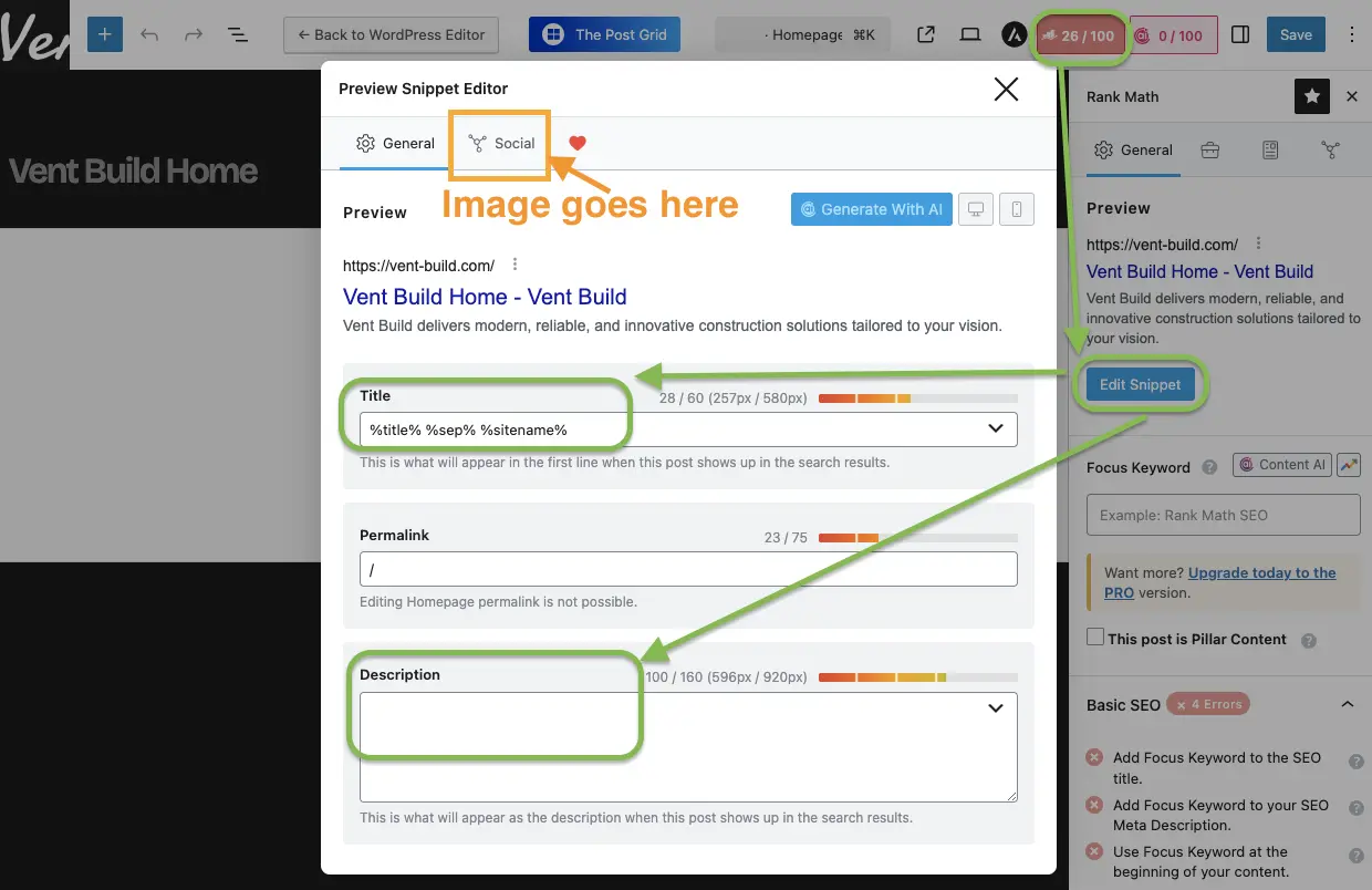
Download: Rank Math SEO on WordPress.org
5. LiteSpeed Cache
LiteSpeed Cache dramatically improves website performance with advanced caching and optimization features. This plugin reduced page load time from 3.2 seconds to 0.8 seconds.
- What I Used It For: Page caching for faster load times, image optimization and lazy loading, CSS and JavaScript minification, browser caching configuration, critical CSS generation, database optimization
- Performance Result: Page load time reduced from 3.2s to 0.8s, 60% reduction in page size
Quick Configuration for Best Performance
- Enable Page Cache: Go to LiteSpeed Cache → Cache → Enable cache
- Activate Image Optimization: LiteSpeed Cache → Image Optimization → Enable lazy loading
- Minify CSS/JS: LiteSpeed Cache → Page Optimization → Enable CSS and JS minification
- Enable GZIP: LiteSpeed Cache → Advanced → Enable compression
- Generate Critical CSS: LiteSpeed Cache → Page Optimization → Generate Critical CSS
Download: LiteSpeed Cache on WordPress.org
6. GTranslate
GTranslate makes websites accessible to international audiences through automatic translation to 100+ languages.
- What I Used It For: Multi-language support for international clients, automatic content translation, language switcher in website header, SEO-friendly URL structure for translations
Download: GTranslate on WordPress.org
7. Site Kit by Google
Site Kit integrates essential Google services directly into your WordPress dashboard for comprehensive analytics and insights.
- What I Used It For: Google Analytics 4 integration and reporting, Google Search Console performance tracking, PageSpeed Insights monitoring, Tag Manager for conversion tracking
Download: Site Kit by Google on WordPress.org
8. Microsoft Clarity
Microsoft Clarity provides heatmaps and session recordings to understand user behavior and optimize conversions.
- What I Used It For: Session replay to watch user interactions, heatmap analysis of click patterns, scroll depth tracking, identifying UX issues and friction points
Download: Microsoft Clarity on WordPress.org
9. WPvivid Backup Plugin
WPvivid Backup protects against data loss with automated backups and enables safe development practices.
- What I Used It For: Automated daily website backups, remote storage to Google Drive, pre-update backup safety, site migration and cloning
- Backup Schedule: Daily automatic backups at 2 AM, 7-day backup retention, remote storage to Google Drive
Download: WPvivid Backup on WordPress.org
10. WPCode Lite
WPCode allows safe custom code insertion without theme file editing, perfect for adding tracking scripts and custom styling.
- What I Used It For: Custom CSS for design refinements, Google Analytics enhanced tracking code, Facebook Pixel integration, custom JavaScript for animations
Download: WPCode on WordPress.org
11. 404 Solution
404 Solution provides intelligent 404 error handling to improve user experience and SEO.
- What I Used It For: Automatic 404 error logging, smart redirect suggestions, broken link identification, spelling correction for mistyped URLs
Download: 404 Solution on WordPress.org
12. Duplicate Page
Duplicate Page speeds up development by cloning pages with similar layouts in one click.
- What I Used It For: Duplicating service pages with consistent layout, creating template variations quickly, A/B testing different page versions
Download: Duplicate Page on WordPress.org
13. The Post Grid
The Post Grid creates beautiful project portfolio displays without any coding.
- What I Used It For: Displaying construction projects in grid layout, portfolio filtering by project type, responsive masonry layout, custom post type integration
Download: The Post Grid on WordPress.org
14. Newsletter
Newsletter provides email marketing integration for lead nurturing and client communication.
- What I Used It For: Newsletter subscription forms, email campaign management, subscriber list building, automated welcome emails
Download: Newsletter on WordPress.org
Final Thoughts
Building a professional construction company website with WordPress doesn't require extensive coding knowledge or expensive agencies. With the right combination of Elementor for design, essential plugins for functionality, and proper configuration, you can create a high-performing website that converts visitors into clients.
The Vent-Build website showcases what's possible with carefully selected free and premium tools. From responsive design and SEO optimization to lead capture forms and performance caching, every element works together to deliver a seamless user experience and drive business results.
Ready to build your own construction website? Start with Hostinger's optimized WordPress hosting using promo code HIPSERGEYPBG, install the plugins listed in this guide, and follow the configuration steps to launch your professional online presence.